The Armenian Weekly and Hairenik Weekly unveil a new brand: Embracing growth, legacy and innovation
WATERTOWN, Mass.—The Armenian Weekly and Hairenik Weekly, cornerstones of Armenian-American journalism, are excited to announce the unveiling of a new logo and rebrand. This bold redesign marks a significant milestone in the publications’ long histories of serving the Armenian-American community with timely, insightful news and cultural content. The updated logo represents the organization’s ongoing commitment to innovation, while honoring its rich legacy as a vital resource for the Armenian diaspora.
The new logo will serve as the first step in a broader rebranding initiative that will culminate in a refreshed visual identity for The Armenian Weekly and all other associated Hairenik outlets.
A new chapter for Hairenik Weekly
The new logo for Hairenik Weekly blends modern design elements with references to the organization’s storied history, including its longstanding commitment to advancing the cause of the Armenian people. The sleek, contemporary look of the logos signal the publications’ forward-looking approach, while the carefully chosen colors and symbolism reflect the core values of Hairenik Weekly: community, heritage and resilience, as well as the symbolic Armenian tricolor.
“We are incredibly proud of this new chapter in the history of Hairenik Weekly,” said George Aghjayan, ARF Central Committee member and manager of Hairenik operations. “This redesign is not just a logo change, but a visual representation of our next step into the future as we serve new generations with a core source of information for our community and news from Armenia and Diaspora. We have always been at the forefront of providing meaningful journalism to the Armenian community, and this new logo will reflect that forward-thinking approach as we continue to serve as a trusted resource for Armenians around the world.”
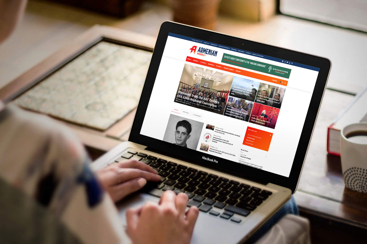
In tandem with the launch of the new logo, Hairenik Weekly is proud to introduce its newly redesigned website. The digital platform reflects the fresh, modern look of the brand while retaining the publication’s rich legacy. The revamped site will offer a user-friendly, dynamic experience for readers, offering easy access to the latest news, in-depth analysis, cultural features and exclusive content. Designed to enhance engagement with the Armenian-American community and beyond, the new website will serve as a hub for both local and global Armenian affairs, seamlessly integrating multimedia content, interactive features and a more streamlined layout. This exciting upgrade marks a new chapter for Hairenik Weekly, ensuring it remains a leading voice in Armenian journalism for years to come.
A new identity for The Armenian Weekly
Following the launch of the new Hairenik Weekly logo, the refreshed visual identity extended to The Armenian Weekly, the flagship publication of the Hairenik organization. The new look for The Armenian Weekly integrates seamlessly with Hairenik Weekly’s branding, reuniting the two publications under one source with broader translation services to reach a greater audience in need of the stable source of Armenian media. The redesign also applies to all other Hairenik outlets, ensuring a unified and modern visual identity across the organization, including the Hairenik Media Center which launched in 2024.
This shift comes at a time when digital media continues to reshape how news is consumed, and Hairenik remains at the forefront of adapting to these changes. The new logo and accompanying branding changes are part of a broader strategy to elevate Hairenik’s presence in the digital age, while continuing to serve as an authoritative voice for Armenians in the United States and abroad.
Embracing the future, honoring the past
While the new brand signifies a bold step into the future, it also reflects deep respect for the heritage of the Hairenik Weekly and The Armenian Weekly. Established in 1899, Hairenik Weekly has long been a trusted source for Armenian news, culture and community updates. The new logo pays tribute to this legacy, combining elements that recall the rich history of the Armenian people with a modern design that is both fresh and relevant.
“This rebranding is a tribute to our past and a celebration of our future,” said Arsineh Valladian, Director of Public Relations and Brand Management for the Hairenik Association. “We’re excited to embrace the possibilities that lie ahead in service of our devoted community, and invite our readers to join us on this journey of transformation.”
What’s next for the Hairenik and Armenian Weekly?
As the new logos roll out across all platforms, Hairenik Weekly and The Armenian Weekly will also introduce new initiatives aimed at further enhancing their digital presence. These include revamped websites, expanded social media engagement and innovative content offerings designed to bring the Armenian-American community closer together.
The changes will be officially unveiled in an upcoming special issue of Hairenik Weekly and The Armenian Weekly, showcasing the new branding alongside articles and reflections on the role of the publications in the Armenian diaspora.
About The Armenian Weekly and Hairenik Weekly
Founded in 1899, Hairenik Weekly is one of the oldest and most respected Armenian-American newspapers. As publications of the Armenian Revolutionary Federation (ARF), The Armenian Weekly and Hairenik Weekly has long been a strong voice for the Armenian-American community, providing readers with news, cultural insights and political analysis.
With a commitment to preserving Armenian identity and heritage, we serve as a bridge between Armenia, the global diaspora and the larger world.
To view the digital edition of both publications, please visit www.armenianweekly.com and www.hairenikweekly.com.


The redesign looks ridiculous and is extremely buggy, unprofessional, and generally a pain to navigate compared to the previous one.
Dear Fellow Ungers,
I too have a problem with this re-branding. How does a red banner simply honor the past, or indicate for the future?
I am all for progress; we have much talent, let’s use it
Greg Minasian
Andover, MA
I am not a fan of the new website / layout. Less is NOT more…
I love the rebranding, look forward to great content!