
My Uncontroversial Proposal to Alter an Armenian National Symbol
Last month, Deputy Speaker of the National Assembly Alen Simonyan sparked a minor controversy when he took to Facebook to express nostalgia for the tune of the Soviet-era anthem composed by Aram Khachaturyan. Of course, the matter was quickly brushed aside with parliamentarians noting that there are more pressing issues on the agenda. Yet that wasn’t enough to stop the ensuing parade of think-pieces, op-eds, historical research articles and rants over whether or not the current anthem is “Armenian enough” on the internet. International observers, for their part, poked fun at obvious parallels with Russia’s re-adoption of the Soviet anthem.
The ARF, which feels a particular sense of attachment to the history and symbolism of the First Republic, condemned the very notion as legally-baseless. Their statement read “Our state symbols, which were created thanks to the sacrifices of those who were martyred for the establishment of our nationhood, are non-negotiable.”
Debates over changing anthems, flags or coats-of-arms pop up with astounding regularity on the Hye-Net. Everything from the royal houses represented on the shield to the colors and shape of the Tricolor has been subject to angry deliberations on the web.
Of course, I have private opinions on most of these topics, but I figured we could take the opportunity to discuss one small change to our national symbols. My grievance might sound pedantic but could be easily addressed without angering any of the parties involved:
Changing the ratio of the flag.


Yeah, that’s right. I’m complaining about that. The current flag is way too long. You probably haven’t realized it until you read this. Once noticed however, this fact cannot be unseen.
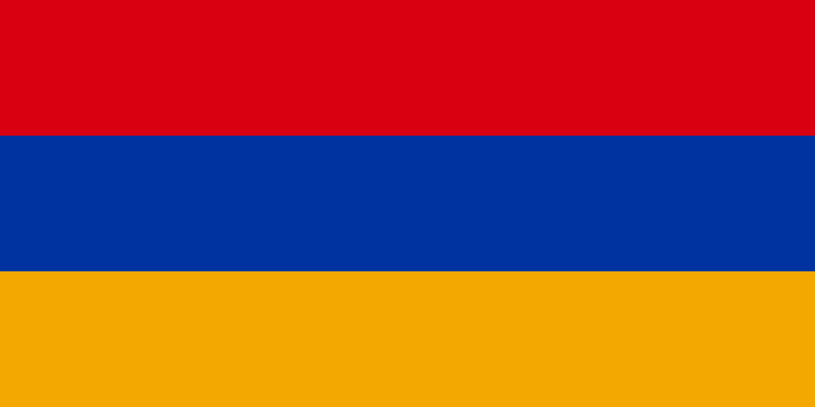
Though the current flag is a faithful copy of the original tricolor from the First Republic, it doesn’t share the same proportions. The flag of the First Republic, like the majority of world national flags, has a 2:3 aspect ratio. This means that it is one-third longer than it is high. This flag is still in use by the majority of diaspora organizations.

Flag of the First Republic compared to the the current flag at scale. The current flag is both shorter and longer.
The current national flag of Armenia, which uses the same three colors: red, blue and a slightly darker shade of orange uses the 1:2 aspect ratio, meaning that it is twice as long as it is high. It follows the design guidelines set for the flag of the Armenian Soviet Socialist Republic, which it replaced.

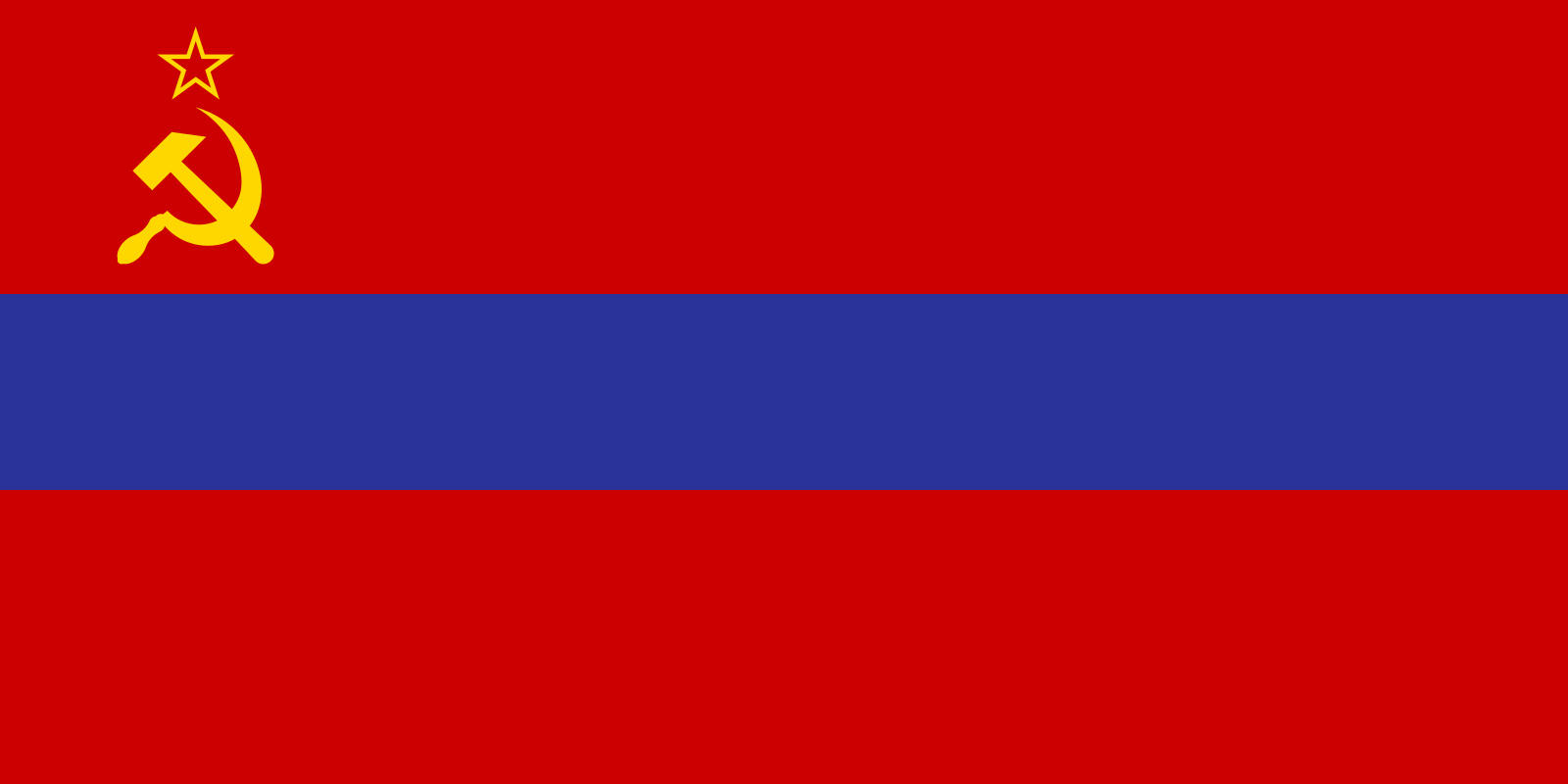
Communist proportions
This may seem like a trivial detail but consider the aesthetic consequences. The hoist’s short breadth often causes it to crumple along its length in windy weather. This is because there isn’t enough vertical fabric to catch the wind. A wider surface would allow it to ripple and float gracefully on its mast.
The differences in proportion also make the tricolor look conspicuous when flown next to the flags of other nations, most of which use the 2:3 ratio. This effect is amplified by the fact that the bands are horizontal. Again, I understand how this might sound like the neurotic ramblings of a sociopath, but symmetry matters.

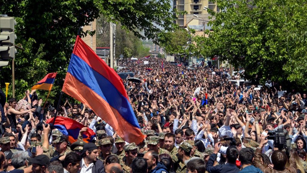
Finally, it’s droopy. Yeah, I’m complaining about that too. Anyone who’s been to a protest in Armenia in the last 20 years can tell you that years of injustice and corruption pale in comparison to the frustration of constantly getting slapped in the face by someone else’s flag. Yes, it’s an honor to get slapped by the national flag. It’s also really annoying! There is a reason why the law stipulates that the “lower part of the flag should be at least 2.5 m off the ground.” Flags floating defiantly over crowds send a stirring message, but most of the time, they’re just messing up our hair.

The problem with changing long-established national symbols is that the mere suggestion opens a can of worms. Every Tom, Dick and Hagop has an individual opinion, aesthetic sensibilities and political motivation. Hell, while we’re at it, why don’t we amend the Armenian Constitution to turn the country into a monarchy? (I can just hear the cracking of fingers getting ready to type in reply “well ACTUALLY…”)
The changing of flags, anthems or coats-of-arms might form the basis of a debate for another day. But if we must change a symbol, why not just tweak the ratio for the current flag? No additional symbolism, no changing colors, no need to redefine the meaning or rewrite laws. Such a change would also be pretty inexpensive if the replacement of flags is mandatory only for the exterior of official buildings. The reward for this effort would be consistency between flags flown in the homeland and diaspora, an unbroken link to our democratic history, harmonious aesthetics and sheer practicality.

Very interesting detail about our flag’s dimensions.
It would be interesting to learn how other Former SSR’s and their diasporas handled this issue. Did they opt of the 2×3 ratio?
Estonia, Lithuania, Ukraine and Georgia (both with its pre-2003 and current flag) have returned to their 1918 (2:3) ratios. Russia, Azerbaijan, Armenia, Moldova, Lithuania and Belarus (both pre-1995 and current) use the Soviet-era 1:2 ratio. The Central-Asian countries (which didn’t have flags before the USSR) have also adopted the 1:2 ratio (except for Turkmenistan which uses 2:3).
I think it’s great to make the change